04.06.15
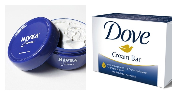
It was recently reported in Europe Online that Nivea and Dove are in a legal battle at the moment - over the color, dark blue. The two brands spent a day in a German courtroom last week, fighting for the right to use dark blue on their packaging.

A Dove ad from the 1960s.
Beiersdorf, which manufactures and markets Nivea, sent its lawyers to appeal a patent court directive in place since 2013. The judge had ruled that the shade of blue could only be registered as an identifying feature if 75% of the German public assumes and associated a blue container is a Nivea product.
So how much of the public were able to see blue and "think" Nivea? Not enough - 57.9%.
The outcome of the survey determined that Unilever had won this round of the color battle - and Nivea's blue was voided as a registered trademark, giving Dove the legal right to continue to use dark blue on its packaging for soap and other personal care products. Beirsdorf had previously been awarded the right to be protect the color as an identifying feature first, however - in 2007. (The battle over blue has been going on for years, apparently.)
Why Brands Love Blue
Blue is a calm, peaceful, and relaxing color, but most importantly for a brand, it can inspire trust. Many banks use blue. Facebook, Twitter and Linked In also all use blue - and of course, "Tiffany Blue" is instantly recognizable.
But, when did blue become such a hot color in packaging design for beauty products? Maybe brands are also thinking about social media, and its growing importance. Fast Company and Digital Trends both report that photos with blue will get your brand more clicks on social media. Studies - one conducted by Curalate - say that images with blue as a dominant color perform 24% better than those with high concentrations of red and oranges.
But, Is It 'Nivea Blue'? Who Has Been Using It Longer?
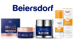
Nivea launched its cream moisturizer, shown above, in its signature blue packaging in 1925. Last year, Beirsdorf announced that it had redesigned its logo, promoting its new color as 'Nivea Blue.' The company said in a statement that they were using the color to create a link between the Beiersdorf name and its strongest brand.
The new logo is just the word, Beirsdorf, in the company's signature font - smooth, rounded letters. An image mark, with the abbreviation BDF, was eliminated from the old logo, in favor of the more simplfied modern design.
About the new logo design, Beirsdorf's CEO Stefan F. Heidenreich commented, "Beiersdorf stands for outstanding products and skin care expertise. The new Beiersdorf logo clearly reflects these values, our core competence and our identity. It is a development of the former logo oriented toward the future and builds a bridge between the company’s tradition and its future."
Even if it seems like Nivea has claimed the hue as its own, Dove has also been printing its name in dark blue for many years - its soap first launched in 1957. Dove's shade of blue seems to be lighter on its packaging during the 1960s, however, as shown in the vintage magazine ad. Other Unilever brands are also known for dark blue - take a look at Vaseline's logo.
The Final Verdict on the Battle for Blue
It's not in yet, stay tuned. In the meantime, blogs like Jezebel are poking fun at both Nivea and Dove, calling the debate the dumbest fight ever - and that can't be good for any brands' image.
A Dove ad from the 1960s.
So how much of the public were able to see blue and "think" Nivea? Not enough - 57.9%.
The outcome of the survey determined that Unilever had won this round of the color battle - and Nivea's blue was voided as a registered trademark, giving Dove the legal right to continue to use dark blue on its packaging for soap and other personal care products. Beirsdorf had previously been awarded the right to be protect the color as an identifying feature first, however - in 2007. (The battle over blue has been going on for years, apparently.)
Why Brands Love Blue
Blue is a calm, peaceful, and relaxing color, but most importantly for a brand, it can inspire trust. Many banks use blue. Facebook, Twitter and Linked In also all use blue - and of course, "Tiffany Blue" is instantly recognizable.
But, when did blue become such a hot color in packaging design for beauty products? Maybe brands are also thinking about social media, and its growing importance. Fast Company and Digital Trends both report that photos with blue will get your brand more clicks on social media. Studies - one conducted by Curalate - say that images with blue as a dominant color perform 24% better than those with high concentrations of red and oranges.
But, Is It 'Nivea Blue'? Who Has Been Using It Longer?
Nivea launched its cream moisturizer, shown above, in its signature blue packaging in 1925. Last year, Beirsdorf announced that it had redesigned its logo, promoting its new color as 'Nivea Blue.' The company said in a statement that they were using the color to create a link between the Beiersdorf name and its strongest brand.
The new logo is just the word, Beirsdorf, in the company's signature font - smooth, rounded letters. An image mark, with the abbreviation BDF, was eliminated from the old logo, in favor of the more simplfied modern design.
About the new logo design, Beirsdorf's CEO Stefan F. Heidenreich commented, "Beiersdorf stands for outstanding products and skin care expertise. The new Beiersdorf logo clearly reflects these values, our core competence and our identity. It is a development of the former logo oriented toward the future and builds a bridge between the company’s tradition and its future."
Even if it seems like Nivea has claimed the hue as its own, Dove has also been printing its name in dark blue for many years - its soap first launched in 1957. Dove's shade of blue seems to be lighter on its packaging during the 1960s, however, as shown in the vintage magazine ad. Other Unilever brands are also known for dark blue - take a look at Vaseline's logo.
The Final Verdict on the Battle for Blue
It's not in yet, stay tuned. In the meantime, blogs like Jezebel are poking fun at both Nivea and Dove, calling the debate the dumbest fight ever - and that can't be good for any brands' image.

