Christian Bird03.16.16
For brands to effectively engage, captivate and compel consumers around the globe, they must understand the impact of color. They must visually express their story through use of color, imagery, materials and textures to deliver a truly sensorial and evocative experience. We shop instinctively using color and shape as our primary triggers for recognition.
How We React To Color
Color is primal and can trigger basic survival responses. We are preprogrammed to react to color in ways we are not fully aware of. Yellow and black are nature’s warning colors; if it’s yellow, black and buzzes, chances are it may hurt us. It is no coincidence that black and yellow is the color combination that the human eye registers first and scores highest for memory retention.
Red, similarly, is a powerful elemental trigger, on one hand signaling a warning or threat and danger. Red can also symbolize sexual maturity in the animal kingdom. We have innate reactions to color, which are embedded in who we are as human beings. Brands can harness these base instincts and desires with the use of color to trigger emotional responses and reactions.
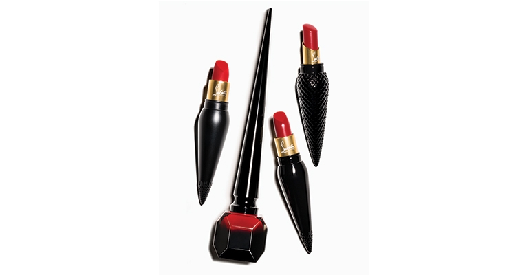
Use of vibrant red in lipstick can heighten attention to the mouth, a symbol of desire. Christian Louboutin has cleverly used red to become an ownable and iconic brand property synonymous with his eponymous shoes; see their new line of cosmetics and how the brand has leveraged red in its packaging.
We also respond instinctively to colors that are rare in nature like purple and white, imbuing them with greater meaning and importance.
Color Meanings Around the World
Our appreciation of color must also reflect and overlay cultural nuances and interpretations. Culturally, color means different things to different people in different parts of the world. In Asia, red is a color of prosperity and happiness while in the West it’s associated with the language of sales and value or with global brand icons like Coca-Cola.
White in Western culture is a color that can signify cleanliness and sterility, bridal purity or even peace, whereas in the East it can signify death and mourning, so the use of a high volume of white may connote a negative meaning. Hence brands must understand the dynamics of color perception across geographies and cultures in order to be able to translate communications across borders, strategically carrying color cues from market to market. According to The Color Association of the United States, 85% of consumers point to color as a primary driver for purchasing behavior.
Pink, for example, is a perennial favorite, ranging from pastel hues to rich shades of fuchsia. In times of economic uncertainty, pink is seen as a comfort color. Its dewiness and vividness conveys the possibility of a bright future. In apparel, pink in India is relied on as a neutral, basic wardrobe color, much as black is in the Western world.
Westerners assign pink to the female gender; however countries like Belgium have typically used pink for baby boys. Regardless of gender, pink represents calmness, nurturing, innocence and beauty from the very first stages of life.
What Color Means To Men & Women
We also need to understand and embrace the difference between the sexes in their approach and response to color. Although limited to seven distinct colors, human vision has the acuity to see a range of subtleties in the spectrum. Understanding the differences in the sexes is also a key factor in the visual armory of brands.
Women have a far more sophisticated appreciation of color, so understanding and using the subtle nuances of color can be a useful part of a brand’s toolkit to create differentiation.
Tap Into the Power of Color, Influence Consumers
Taking ownership of a color can be a key to success; think Tiffany blue. Key to color use is not only volume of color, but also consistency of color usage over time.
Chanel No. 5 and the black/white color palette along with simple use of typography over time, has created something so restrained and recognizable, it’s iconic.
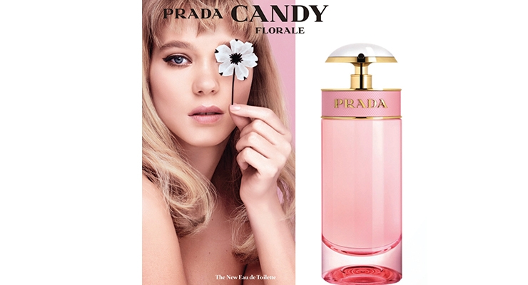
Color can be used in iconic brands to stretch the brand’s elasticity and to reach new audiences with holiday or special edition packaging. Prada Candy uses a large volume of fuchsia in its fragrance packaging, connoting a stronger scent while Prada Candy Florale, a lighter version of the same scent, uses pastel pink and white flowers to convey the difference.
Other visual cues and techniques such as the use of metallics (gold, silver, copper) and techniques like foil, hot stamping, textured varnishes, etc. help signify a prestige brand—nearly every prestige fragrance and cosmetics brand uses some level of metallic color strategy along with high-end printing techniques to elevate quality perception. It is not enough to act premium, the design must feel appropriately premium–using precious metals and special print techniques can add richness and a sense of ritualistic luxury to the brand experience. Ultimately it is how a brand engages you that will determine if you are willing to pay more for the pleasure of owning it.
Color, especially in volume, sets the tone and influences mood, connecting emotionally with consumers anywhere in the world. In the mind of the consumer, color is a dynamic trigger for a brand.
Color strategy used as an integral part of the brand narrative can engage the consumer at a deep psychological level. It can trigger interest, and even simplify the shopping experience. Effective translation and understanding of the power of color is key to influencing consumers across the globe.
About the Author:

Bird
Elmwood’s creative director Christian Bird has held positions at globally recognized firms. Over the past decade, his work has been recognized with numerous awards, including D&AD Product Design awards, DBA Design Effectiveness awards and various Pentawards. Additionally, his work has been published in Digital Arts, Monocle, Wired Magazine and Trend Hunter.
How We React To Color
Color is primal and can trigger basic survival responses. We are preprogrammed to react to color in ways we are not fully aware of. Yellow and black are nature’s warning colors; if it’s yellow, black and buzzes, chances are it may hurt us. It is no coincidence that black and yellow is the color combination that the human eye registers first and scores highest for memory retention.
Red, similarly, is a powerful elemental trigger, on one hand signaling a warning or threat and danger. Red can also symbolize sexual maturity in the animal kingdom. We have innate reactions to color, which are embedded in who we are as human beings. Brands can harness these base instincts and desires with the use of color to trigger emotional responses and reactions.
Use of vibrant red in lipstick can heighten attention to the mouth, a symbol of desire. Christian Louboutin has cleverly used red to become an ownable and iconic brand property synonymous with his eponymous shoes; see their new line of cosmetics and how the brand has leveraged red in its packaging.
We also respond instinctively to colors that are rare in nature like purple and white, imbuing them with greater meaning and importance.
Color Meanings Around the World
Our appreciation of color must also reflect and overlay cultural nuances and interpretations. Culturally, color means different things to different people in different parts of the world. In Asia, red is a color of prosperity and happiness while in the West it’s associated with the language of sales and value or with global brand icons like Coca-Cola.
White in Western culture is a color that can signify cleanliness and sterility, bridal purity or even peace, whereas in the East it can signify death and mourning, so the use of a high volume of white may connote a negative meaning. Hence brands must understand the dynamics of color perception across geographies and cultures in order to be able to translate communications across borders, strategically carrying color cues from market to market. According to The Color Association of the United States, 85% of consumers point to color as a primary driver for purchasing behavior.
Pink, for example, is a perennial favorite, ranging from pastel hues to rich shades of fuchsia. In times of economic uncertainty, pink is seen as a comfort color. Its dewiness and vividness conveys the possibility of a bright future. In apparel, pink in India is relied on as a neutral, basic wardrobe color, much as black is in the Western world.
Westerners assign pink to the female gender; however countries like Belgium have typically used pink for baby boys. Regardless of gender, pink represents calmness, nurturing, innocence and beauty from the very first stages of life.
What Color Means To Men & Women
We also need to understand and embrace the difference between the sexes in their approach and response to color. Although limited to seven distinct colors, human vision has the acuity to see a range of subtleties in the spectrum. Understanding the differences in the sexes is also a key factor in the visual armory of brands.
Women have a far more sophisticated appreciation of color, so understanding and using the subtle nuances of color can be a useful part of a brand’s toolkit to create differentiation.
Tap Into the Power of Color, Influence Consumers
Taking ownership of a color can be a key to success; think Tiffany blue. Key to color use is not only volume of color, but also consistency of color usage over time.
Chanel No. 5 and the black/white color palette along with simple use of typography over time, has created something so restrained and recognizable, it’s iconic.
Color can be used in iconic brands to stretch the brand’s elasticity and to reach new audiences with holiday or special edition packaging. Prada Candy uses a large volume of fuchsia in its fragrance packaging, connoting a stronger scent while Prada Candy Florale, a lighter version of the same scent, uses pastel pink and white flowers to convey the difference.
Other visual cues and techniques such as the use of metallics (gold, silver, copper) and techniques like foil, hot stamping, textured varnishes, etc. help signify a prestige brand—nearly every prestige fragrance and cosmetics brand uses some level of metallic color strategy along with high-end printing techniques to elevate quality perception. It is not enough to act premium, the design must feel appropriately premium–using precious metals and special print techniques can add richness and a sense of ritualistic luxury to the brand experience. Ultimately it is how a brand engages you that will determine if you are willing to pay more for the pleasure of owning it.
Color, especially in volume, sets the tone and influences mood, connecting emotionally with consumers anywhere in the world. In the mind of the consumer, color is a dynamic trigger for a brand.
Color strategy used as an integral part of the brand narrative can engage the consumer at a deep psychological level. It can trigger interest, and even simplify the shopping experience. Effective translation and understanding of the power of color is key to influencing consumers across the globe.
About the Author:
Bird


